CR
My short film and project Alienated represents individuals who feel out of place in their society. Introverted individuals, for example have a hard time approaching others, feeling out of place, and therefore they tend to stick to a smaller friend group. This is precisely the situation of Alienated’s main character Terra. She stays with her one friend Mickey, and him alone, spending the whole film fretting over making friends with new people. Another way it represents characters who feel out of place is through the implication of Terra not being from the planet that the film is set in. This is, or at least it can be interpreted as, an allegory for immigrants in general. Immigrants anywhere are a social group that often feel out of place in an unfamiliar society, whether it is due to how they look or even their mannerisms. This could cause things such as bullying, insecurity, and isolation, all of which get explored in the film to some degree. These sorts of situations are especially the case with younger immigrants, who frequent environments where talking to people your own age is unavoidable.
There are a few elements that give the film a sense of branding. The fonts used in the film and in advertising are sharp, giving the project a modern and futuristic feeling. When animated, on both the film and the website, the fonts fade in in some way. This gives the project consistency all throughout, so viewers know what to expect in terms of tone. This works in combination with the color palette. The colors are bright and sweet, demonstrating the light-hearted tone. It uses greens, yellows, and browns, as it is an outdoor setting. The only altered a bit in post in order to make them a little bit brighter in the films final production. Black and white colors alongside the brighter ones are on both the website and postcard. They hint at the black and white filtered dream sequences while simultaneously making the colors used in the branding more appealing to the eye, offsetting the brighter colors. The color and fonts within the branding work together with the soundtrack of the film as well. The film uses synth-wave. Synth is a staple of both sci-fi genres and, as of late, it has been used in coming of age films. This makes the use of synth-wave works as both a call-back to sci-fi, another alien filled genre, and the actual genre of Alienated, as a coming of age. Therefore, the music in this production remains lighthearted for a majority of the movie, save for the dramatic music during one of the dream sequences. This communicates a family friendly and whimsical coming of age drama for consumers of the website
The film also has a variety of social media accounts. Most people frequent social media, especially the target audience for Alienated, young adults or teenagers. With easily consumed content, the film promotes itself with an official Twitter and an official Instagram. The posts, with captions for a bit of provided context, are available to all, and are easily searched up, being titled ‘AlienatedMovie’ or ‘AlienatedFilm’. Both accounts post pictures and videos, all of which are behind-the-scenes content and even some bloopers, as to have the audience be exposed to the film without them being majorly spoiled before the watching experience. The posts aren’t available on the website or the postcard and are exclusive to the social media accounts alone. The film also has it’s own website. The website shows the audience a gallery or high quality images from the film, which is exclusive to the website alone, much like the social media posts. It’s the only place outside the film where you can find names of the actors directly, as well as which part the respective actors play, for any curious audience members. The website is also is the only place in the public eye that has direct links to both of the films social media accounts.
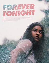
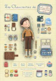
The research I did on the film made me want to give everything a more modern look. This influenced the font choice and even the music. Originally, I realized that a good amount of coming of age movies contain acoustic sound, so I wanted to use that. However, as mentioned, synth-wave is now being used in more coming of age films, and is often used in the sci-fi genre. The strangeness of the aliens gave me an almost sci-fi tone when thinking about script. This is how I decided to choose synth-wave to use in Alienated. In doing so, I didn’t exactly challenge conventions, but more so went with the more recent option for soundtracks within the genre. I found that I followed conventions of coming of age by keeping a brighter color pallet, as other genres like sci-fi or horror tend to have cooler toned color palettes done through filters and lighting editing done in post-production. There was, however, one way I definitely broke convention in my film, albeit in a smaller way. I did find that the more whimsical coming of age films, like my own, used fonts that either looked like handwriting or like classical typewriters. The more modern and squared off fonts tend to be used in more serious and dramatic pictures. Essentially these types of fonts tend to be associated with yes, the coming-of-age drama, but ones with darker tones. As for my film, it is relatively lighthearted, so the primary font choice does break convention.


Comments
Post a Comment